

Shelf Planner
Brand Guidelines
This page is there to help you understand who we are and give you the tools needed in your quest to arouse curiosity, enthuse, inspire and share knowledge to help others in their quest to arouse curiosity, enthuse, inspire and share knowledge.
Why? Because that’s what we do.
01. Our Brand
Brand Guidelines
Shelf Planner wants to balance the uncomplicated and direct with the lively and flexible, the safe with the challenging, the serious with the inspiring. We highlight personal presence in a contemporary digital context as much as digitization in a human context. We want to be scalable, enthusiastic without unnecessary hassle. And you, we arouse curiosity too!
xxx. Simplified.
Vision.
This page is there to help you understand who we are and give you the tools needed in your quest to arouse curiosity, enthuse, inspire and share knowledge to help others in their quest to arouse curiosity, enthuse, inspire and share knowledge.
Why? Because that’s what we do.
Mission.
This page is there to help you understand who we are and give you the tools needed in your quest to arouse curiosity, enthuse, inspire and share knowledge to help others in their quest to arouse curiosity, enthuse, inspire and share knowledge.
Why? Because that’s what we do.
Values.
This page is there to help you understand who we are and give you the tools needed in your quest to arouse curiosity, enthuse, inspire and share knowledge to help others in their quest to arouse curiosity, enthuse, inspire and share knowledge.
Why? Because that’s what we do.
02. Logotype
Brand Guidelines
Shelf Planner wants to balance the uncomplicated and direct with the lively and flexible, the safe with the challenging, the serious with the inspiring. We highlight personal presence in a contemporary digital context as much as digitization in a human context. We want to be scalable, enthusiastic without unnecessary hassle. And you, we arouse curiosity too!
xxx. Simplified.
03. Colours
Our colour palette balances the safe with the challenging, the serious with the lively. Our expression is allowed to be inspiring and at the same time enthusiastic. Consistency and clear areas of use give us the opportunity to strengthen identity and message through emotions channel-independent.
Primary
Our green is used as a supporting profiling colour. It does not have to be dominant at all, but is the colour that finally says that we are the users. Mainly by logo.
SP Purple
Hex – #714C71
RGB – 0, 177, 137
CMYK – 75, 0, 58, 0
PMS – 339
Secondary
Our green is used as a supporting profiling colour. It does not have to be dominant at all, but is the colour that finally says that we are the users. Mainly by logo.
SP Pink
Hex – #714C71
RGB – 0, 177, 137
CMYK – 75, 0, 58, 0
PMS – 339
SP Teal
Hex – #714C71
RGB – 0, 177, 137
CMYK – 75, 0, 58, 0
PMS – 339
Accent
Our green is used as a supporting profiling colour. It does not have to be dominant at all, but is the colour that finally says that we are the users. Mainly by logo.
SP Green
Hex – #714C71
RGB – 0, 177, 137
CMYK – 75, 0, 58, 0
PMS – 339
SP Indian
Hex – #714C71
RGB – 0, 177, 137
CMYK – 75, 0, 58, 0
PMS – 339
SP Ocean
Hex – #A7D6E9
RGB – 0, 177, 137
CMYK – 75, 0, 58, 0
PMS – 339
SP Hay
Hex – #623B57
RGB – 0, 177, 137
CMYK – 75, 0, 58, 0
PMS – 339
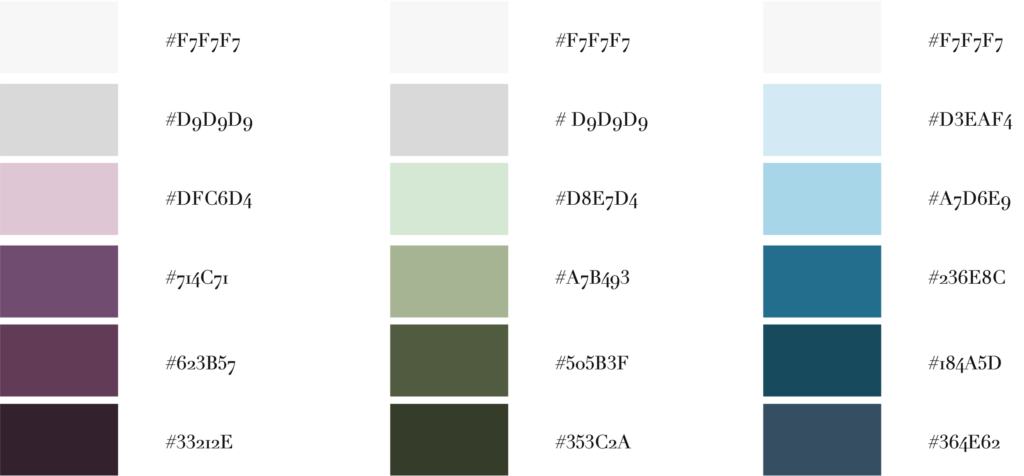
Nuances & Shades
There are lighter and darker shades of all colours, they are for any shadows and highlights to bring depth.
#F7F7F7
#F7F7F7
#F7F7F7
#D9D9D9
#F1F3EE
#D3EAF4
#DFC6D4
#D8E7D4
#A7D6E9
#714C71
#A7B493
#236E8C
#623B57
#505B3F
#184A5D
#33212E
#353C2A
#364E62
04. Typography
Typography is a central design element in our visual identity. The written language communicates with everything from the word choice and language use of the tonality to the color and shape of the fonts. Also how surface is laid out, size ratios between elements or how these are combined says something. No matter what we say, when or where, the main focus is on being simple, clear and consistent.
Fonts
Typography is a central design element in our visual identity. The written language communicates with everything from the word choice and language use of the tonality to the color and shape of the fonts. Also how surface is laid out, size ratios between elements or how these are combined says something. No matter what we say, when or where, the main focus is on being simple, clear and consistent.
Josefine Sans
Open Sans
Merriwheather
05. Visual Elements
We have a nice toolbox with graphic elements to strengthen Shelf Planner’s feeling and expression. The purpose is to invigorate complement photography and typography, we want to create life and have the opportunity for flexibility. This is where accent colours come in most handy. Our visual identity is not illustrative or graphic, so it is with common sense and a gentle hand that we botanize in and pick off the smorgasbord.
Info Boxes
In our toolbox we have five different infoboxes to use in different contexts. Because we like consistency, we prefer a primary or secondary color, but on the other hand we do not like the lifeless and monotonous, so if necessary we like to liven it up with accent color.
06. Graphics
Our images are (also) an essential part of our communication. Using images in a consistent way, they help us to convey a unified image of who we are.